Repository navigation
[Firefox] Toolbar icon's new rule count looks too much like a notification #12308
Description

Did HTTPS Everywhere recently have an update affecting the toolbar icon in Firefox? I thought it didn't look like this before tonight. (I just checked against the old version of the Tor Browser Bundle I had laying around, and its version of HTTPS Everywhere didn't have a counter like this in it.)
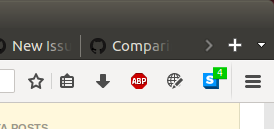
About literally every time I change tabs, the number either disappears, appears, or changes and distracts me. It's in about the same area of the screen and vaguely styled similar to how Facebook notifications are shown in Facebook, so I thought there was some notification there for me. The modern web has seriously trained me to click on notification icons like that as soon as possible to hopefully get something interesting or make sure my friend doesn't think I'm ignoring them, and to make the notification go away. It took me a minute of clicking different things in the dropdown menu looking for a notification before I realized the number was just a count of active rules, and that the notification count wasn't going to go away.
I guess I can just remove the toolbar icon, though I love the project and want it to have the best defaults and was curious if anyone else had this problem. Maybe it could default off, be a different color, or have the count have no background? (EDIT: I finally noticed the "Show Counter" option on the Add-ons page. Another possibility is to show that in the dropdown too.)
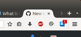
... Heh, not really related, but if you right-click on the icon, hit customize, and then close the customize tab, then the HTTPS Everywhere toolbar icon's counter turns red until you switch to a different tab. I'm a little amused how right after I mention that I think the icon looks too much like a Facebook notification icon, I find a bug that makes it look even closer to one. I guess I'm just including this screenshot here as an (accidentally realized) example of a possible design that's undeniably close to Facebook notifications, and to possibly emphasize the similarity of HTTPS Everywhere's current design.
Activity
cschanaj commentedon Sep 1, 2017
I can confirm the issue regarding the counter color turning red on "Customize".
Not sure if they are going to change the default behavior (or the color), but I agree it is sort of too catchy now. If possible, I prefer the counter to use a less "eye-catching" color. Best if it is consistent with uBlock.
P.S. You can disable the counter by "Tool" > "Add-ons", then click the "Perference" button for "HTTPS Everywhere",.uncheck "Show counter"
Bisaloo commentedon Sep 1, 2017
+1
+1
I agree that it's too catchy right now and a white/grey background may be better but:
Bisaloo commentedon Sep 1, 2017
Related discussion in #10002.
cschanaj commentedon Sep 1, 2017
I think it should be at least default off if we ain't going to change the color.
IMHO, there is too many information on the icon of the extension and a default on counter add too much information.
Our icons have different colors, though.
I haven't dig into the UI code at all. sorry.
cschanaj commentedon Sep 1, 2017
@koops76 Personally, I don't recommend configurable colors. It seem unnecessary for a 'privacy' extension which rewrite HTTP to HTTPS. I'd rather it is default off if the color isn't meant to be changed.
cschanaj commentedon Sep 1, 2017
^ this is a nice feature to have.
cschanaj commentedon Sep 1, 2017
@koops76 Honestly, I cannot judge which color is the best. From #1775, I got the impression a lot of https-everywhere user use uBlock as well. It will be great from my perspective to be consistent with that.
I'd like to note that I am against adding configurable colors, because it seems a unnecessary feature for an extension of this type. (In particular, Privacy Badger does not have configurable colors).
If a user find the counter more annoying than useful, they will disable it themselves. The best we can do is to make it convenient to change the setting via the popup UI if changing the default behavior is not an option.
J0WI commentedon Oct 30, 2017
I think this has been fixed in #12552