You signed in with another tab or window. Reload to refresh your session.You signed out in another tab or window. Reload to refresh your session.You switched accounts on another tab or window. Reload to refresh your session.Dismiss alert
{{ message }}
Repository navigation
new SVG files in /progit/progit2/filtered_svg #1291
Sorry for the delay. Here's a side-by-side, PNG on the left:
I see a few issues, but I think what you're asking is whether the PNG should be considered the "right" version. In general I think the answer is yes, although there are probably some things about the PNG that could be improved, and if you see an obvious bug, I'd say go ahead and fix it.
Your fix looks pretty good. I just have a couple of concerns:
The weight of the ? block feels a bit heavy. This led me to try setting all the font-weights to 700, and I think I like it better that way.
The Working Directory block's centering seems off? The first line seems set too far to the left.
Otherwise this looks great, really fantastic work!
When I look at the file with the browser, then the block "Working Directory" actually appears as not centered, as in your image above.
But when I open the file with Inkscape, this block is displayed as centered.
I need to examine this crazy behavior more closely in order to understand it.
By "All font weights 700", do you mean really all the texts?
If yes, then a script can do this faster and more error-free.
@jnavila
If Ben agrees: please change the value for "font-weight" to "700" for all texts.
About the error "incorrect display of centered text with multi-line text blocks"
This is what I found out:
In Inkscape, the multi-line text is displayed as a single object, as you would expect when creating the second line by pressing the Enter key. Then you have to adjust the line spacing (leading) manually with Inkscape.
In the file here, this function has no effect, so I suspect that the author of the Sketch file set two separate lines, aligned them and then grouped them. Why Inkscape doesn't recognize an object group here, I can't say yet.
Changing the font has also changed the letter-spacing (tracking) of the font. As the texts were written left-aligned in Sketch, text blocks now aligning to the center are not displayed the right way (I had already pointed this out in an earlier post).
Possible workarounds might be:
a) you can open the affected files with Adobe Illustrator (where the multi-line is recognized as a group of separate objects), dissolve the group, define the lines as centered text, and group them again. The downside is that the file is much larger than with Inkscape.
or b) delete the text block in Inkscape and re-enter the text as a multi-line block and adjust the line spacing as needed.
I have made the necessary corrections to this file.
When the replacements are made for font-weight, I will check all diagrams one after the other.
@jnavila
I don't think it's a chrome bug, because the position error with Firefox also occurs here.
Did you also test the file in my repo? (see link as above)
The code is slightly different for the same area (here lines 37 + 38):
As I said before, I don't understand enough about the code to analyze it well. But I see that "line-height" is defined in my file and not in your code example. For me this supports my thesis that two separate lines of text (in your file) and a 2-line block of text (in my file) are defined.
I may be wrong, but I don't know a better explanation right now.
So somehow, chrome gets the width of the second text block wrong, maybe due to letter spacing, suprising given that it's a mono font.
I had a look at your file. Its structure has been too changed to be able to recognize the initial structure. For instance the boxes were rectangles and text grouped together, now most of the stuff is broken apart and the groups don't make sense. Applying automatic on this is almost impossible, because the structure of the file no longer reflects the structure of the drawing.
Anyway, the alignment of "Working" and "Directory" is still preserved in the structure of your file, so it should apply when rendered. And it is correctly rendered when I type display reset-ex2.svg:
"working" is 7 characters long, "directory" is 9, so the centering with mono fonts lets one letter on each side.
So for the browsers, obviously an interaction with maybe the font not taken as mono.
I understand your problem, which is probably caused by my way of working. When I open the file with Inkscape, I have to break up the groups above to be able to change individual objects. After all adjustments have been made, I have grouped all elements and saved them.
Inkscape offers several options how to generate the SVG files, as I described before. Beside the "full-size" there are also "optimized" and "compressed" file versions.
While the "optimized" variant reduces the file size as much as possible without losing readability, the compressed file contains only binary data.
The "full-size" file is certainly better suited for the analysis. But it is also much larger.
I edited the file again (under the new name: reset-ex2_full.svg), restored the groups and saved them as a "full-size" file. I hope you can do the analysis better with it. As long as we are still in the analysis phase, I can easily imagine editing the other files accordingly.
If the files have to be adapted productively at a later date, the subsequent reorganization of the groups is an unnecessary additional effort for the presentation of the diagrams in the respective formats. As long as it is not necessary to change these diagrams regularly.
The creation of a group structure is certainly necessary and helpful in the development and design of the graphics. For the later representation (on screen, in a PDF, etc.) it is not relevant.
In Inkscape, breaking groups is not necessary in order to work on elements. You can right-click "enter in group" to edit sub parts of groups without disrupting the objects grouping hierarchy. Alternatively, double-clicking repeated times on a specific object brings you recursively into the path of containing groups.
You can even reorganize the structure of the file. If you open the Object panel, you can drag and drop nodes to put them into groups. For instance, the text element containing the question mark should belong to the group named "Line-+-symref-+-goldref" . More generally, it's better to keep things organized in our source code. If you think it takes too long, we'll see whether the changes are worth it.
As for formats, full or optimized deal with whether or not Inkscape saves additional data for its internal purpose. This does not change the rendering of the SVG file, it's just some additional data on the side of the SVG stuff. For compressinf, well, the file is just zipped to occupy less space, but once decompressed, it's the same file; for us it's better to keep the format in clear, because most of the time, we can use git to check differences.
In Inkscape, breaking groups is not necessary in order to work on elements ...
This information is really absolutely new to me.
This is, of course, a completely new situation. I agree with you that it is better to maintain the organization of the groups.
I have had little experience with Inkscape so far. I knew it as a powerful open source software, as required by the OP in the first threat. However, I mainly worked with payware like Illustrator.
... we'll see whether the changes are worth it.
The effort is definitely worth it if you are considering the quality difference from the "old" PNG files to the SVG files.
It was necessary to remove the wrong stroke-width="1".
It was logical to replace the font, only used on macOS, with a commonly available font.
It is necessary to correct the resulting centering errata.
And finally, it is necessary to strengthen the somewhat weak contrasts, in some diagrams, to improve readability.
Ben said at the beginning of this thread:
The weight of the ? block feels a bit heavy. This led me to try setting all the font-weights to 700, and I think I like it better that way.
It would be nice if you could do it by script.
In this comment I already pointed out that the font color within the background areas and the transparent color fields should have #808080 (e.g. the files replace*.svg and reset-*.svg).
It would be extremely helpful, if this could be done by script as well.
EDIT:
I edited the sample file again without resolving the groups. Only the blocks with 2-lined text had to be re-written to eliminate a centering issue.

Activity
ben commentedon Aug 14, 2019
Porting my comment here from over there:
Sorry for the delay. Here's a side-by-side, PNG on the left:
I see a few issues, but I think what you're asking is whether the PNG should be considered the "right" version. In general I think the answer is yes, although there are probably some things about the PNG that could be improved, and if you see an obvious bug, I'd say go ahead and fix it.
Your fix looks pretty good. I just have a couple of concerns:
?block feels a bit heavy. This led me to try setting all the font-weights to 700, and I think I like it better that way.Working Directoryblock's centering seems off? The first line seems set too far to the left.Otherwise this looks great, really fantastic work!
max123kl commentedon Aug 15, 2019
First of all, thanks for the compliment.
When I look at the file with the browser, then the block "Working Directory" actually appears as not centered, as in your image above.
But when I open the file with Inkscape, this block is displayed as centered.
I need to examine this crazy behavior more closely in order to understand it.
By "All font weights 700", do you mean really all the texts?
If yes, then a script can do this faster and more error-free.
@jnavila
If Ben agrees: please change the value for "
font-weight" to "700" for all texts.max123kl commentedon Aug 15, 2019
About the error "incorrect display of centered text with multi-line text blocks"
This is what I found out:
In Inkscape, the multi-line text is displayed as a single object, as you would expect when creating the second line by pressing the Enter key. Then you have to adjust the line spacing (leading) manually with Inkscape.
In the file here, this function has no effect, so I suspect that the author of the Sketch file set two separate lines, aligned them and then grouped them. Why Inkscape doesn't recognize an object group here, I can't say yet.
Changing the font has also changed the letter-spacing (tracking) of the font. As the texts were written left-aligned in Sketch, text blocks now aligning to the center are not displayed the right way (I had already pointed this out in an earlier post).
Possible workarounds might be:
a) you can open the affected files with Adobe Illustrator (where the multi-line is recognized as a group of separate objects), dissolve the group, define the lines as centered text, and group them again. The downside is that the file is much larger than with Inkscape.
or b) delete the text block in Inkscape and re-enter the text as a multi-line block and adjust the line spacing as needed.
I have made the necessary corrections to this file.
When the replacements are made for font-weight, I will check all diagrams one after the other.
jnavila commentedon Aug 15, 2019
For the centering, I checked the svg and every thing is correctly describe.
Note the
text-anchor="middle"and thexvalues at half the rect's width.I think it's a positioning bug from chrome. Look at the rendering of the internal viewer:
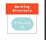
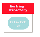
While in chrome:
So somehow, chrome gets the width of the second text block wrong, maybe due to letter spacing, suprising given that it's a mono font.
max123kl commentedon Aug 15, 2019
@jnavila
I don't think it's a chrome bug, because the position error with Firefox also occurs here.
Did you also test the file in my repo? (see link as above)
The code is slightly different for the same area (here lines 37 + 38):
As I said before, I don't understand enough about the code to analyze it well. But I see that "line-height" is defined in my file and not in your code example. For me this supports my thesis that two separate lines of text (in your file) and a 2-line block of text (in my file) are defined.
I may be wrong, but I don't know a better explanation right now.
The first line is off center, not the second.
jnavila commentedon Aug 15, 2019
I had a look at your file. Its structure has been too changed to be able to recognize the initial structure. For instance the boxes were rectangles and text grouped together, now most of the stuff is broken apart and the groups don't make sense. Applying automatic on this is almost impossible, because the structure of the file no longer reflects the structure of the drawing.
Anyway, the alignment of "Working" and "Directory" is still preserved in the structure of your file, so it should apply when rendered. And it is correctly rendered when I type
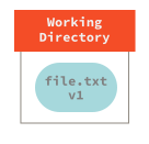
display reset-ex2.svg:"working" is 7 characters long, "directory" is 9, so the centering with mono fonts lets one letter on each side.
So for the browsers, obviously an interaction with maybe the font not taken as mono.
max123kl commentedon Aug 16, 2019
I understand your problem, which is probably caused by my way of working. When I open the file with Inkscape, I have to break up the groups above to be able to change individual objects. After all adjustments have been made, I have grouped all elements and saved them.
Inkscape offers several options how to generate the SVG files, as I described before. Beside the "full-size" there are also "optimized" and "compressed" file versions.
While the "optimized" variant reduces the file size as much as possible without losing readability, the compressed file contains only binary data.
The "full-size" file is certainly better suited for the analysis. But it is also much larger.
I edited the file again (under the new name: reset-ex2_full.svg), restored the groups and saved them as a "full-size" file. I hope you can do the analysis better with it. As long as we are still in the analysis phase, I can easily imagine editing the other files accordingly.
If the files have to be adapted productively at a later date, the subsequent reorganization of the groups is an unnecessary additional effort for the presentation of the diagrams in the respective formats. As long as it is not necessary to change these diagrams regularly.
The creation of a group structure is certainly necessary and helpful in the development and design of the graphics. For the later representation (on screen, in a PDF, etc.) it is not relevant.
jnavila commentedon Aug 16, 2019
In Inkscape, breaking groups is not necessary in order to work on elements. You can right-click "enter in group" to edit sub parts of groups without disrupting the objects grouping hierarchy. Alternatively, double-clicking repeated times on a specific object brings you recursively into the path of containing groups.
You can even reorganize the structure of the file. If you open the Object panel, you can drag and drop nodes to put them into groups. For instance, the text element containing the question mark should belong to the group named "Line-+-symref-+-goldref" . More generally, it's better to keep things organized in our source code. If you think it takes too long, we'll see whether the changes are worth it.
As for formats, full or optimized deal with whether or not Inkscape saves additional data for its internal purpose. This does not change the rendering of the SVG file, it's just some additional data on the side of the SVG stuff. For compressinf, well, the file is just zipped to occupy less space, but once decompressed, it's the same file; for us it's better to keep the format in clear, because most of the time, we can use git to check differences.
max123kl commentedon Aug 17, 2019
This information is really absolutely new to me.
This is, of course, a completely new situation. I agree with you that it is better to maintain the organization of the groups.
I have had little experience with Inkscape so far. I knew it as a powerful open source software, as required by the OP in the first threat. However, I mainly worked with payware like Illustrator.
The effort is definitely worth it if you are considering the quality difference from the "old" PNG files to the SVG files.
stroke-width="1".Ben said at the beginning of this thread:
It would be nice if you could do it by script.
In this comment I already pointed out that the font color within the background areas and the transparent color fields should have #808080 (e.g. the files replace*.svg and reset-*.svg).
It would be extremely helpful, if this could be done by script as well.
EDIT:
I edited the sample file again without resolving the groups. Only the blocks with 2-lined text had to be re-written to eliminate a centering issue.