This repository was archived by the owner on Jun 21, 2023. It is now read-only.
Repository navigation
This repository was archived by the owner on Jun 21, 2023. It is now read-only.
Only show Sign in with your browser option in sign in dialog #2194
Description

Summary
We have had lots of conversations about our sign-in workflow over the last couple months.
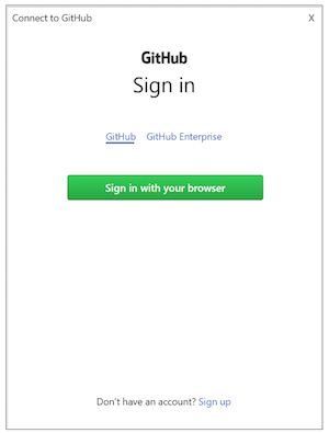
One thing we have discussed is only showing the option to Sign in with your browser and removing additional fields. This will simplify sign in for users and save them time.
- For signing in with
GitHubthis means removing the username or email and password field. - For signing in with
GitHub Enterprisethis means keeping the server address field and removing the token field.
Example:
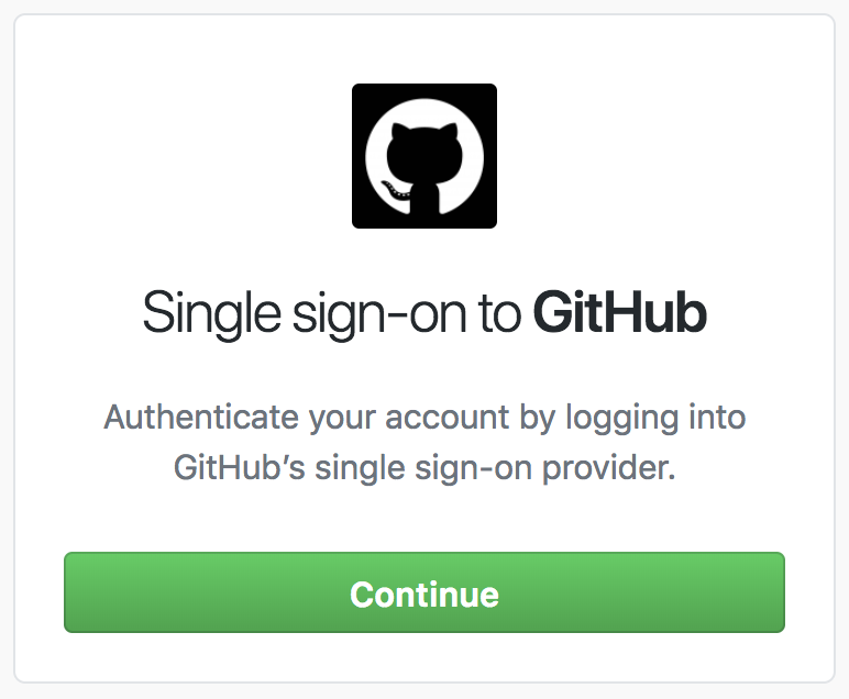
Perhaps we could make the dialog look similar to the SSO to GitHub dialog:
Activity
meaghanlewis commentedon Jan 23, 2019
What thoughts do you have about this @donokuda @grokys @jcansdale @StanleyGoldman? And @donokuda any ideas on what the dialog could look like?
donokuda commentedon Feb 4, 2019
I made a prototype in Figma to walk through a sign-in with the login fields deemphasized.
Here's a gif walkthrough regardless:
I tried to incorporate @grokys's suggestion:
I also modified the Enterprise login flow slightly where we show a disabled Sign In button and then show/hide any UI's as needed:
Currently in @jcansdale's pull request, the Enterprise tab shows only a field until you type in a valid enterprise instance URL:
However, the form looked strange and incomplete to me because a submit button doesn't appear until you fill in the single field. By adding a submit button, the form doesn't feel as much as a "dead end"
I pushed a branch that tests laying out the initial sign in screen, but I got blocked trying to stub out the other parts of my proposal.
jcansdale commentedon Aug 5, 2020
This has been done. I hope you're well @meaghanlewis! 😄